2026
Kanban.Now

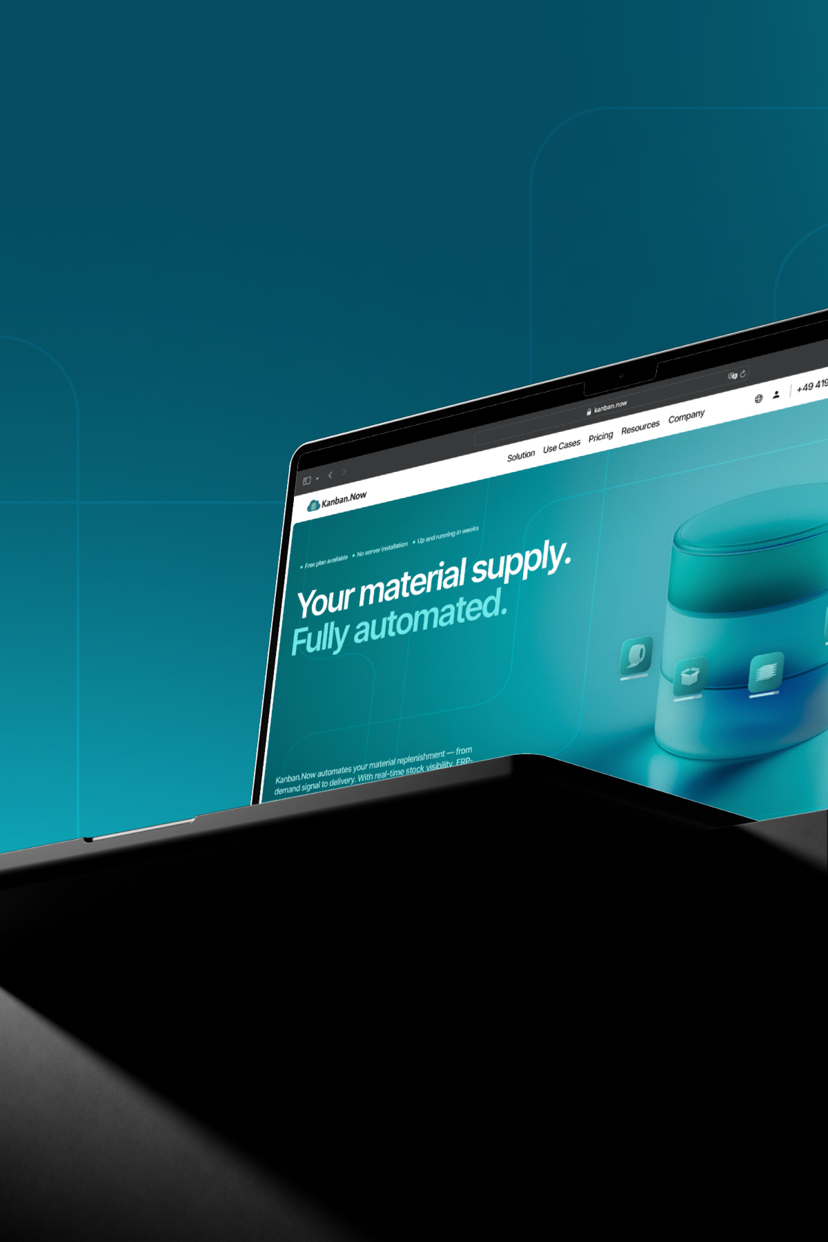
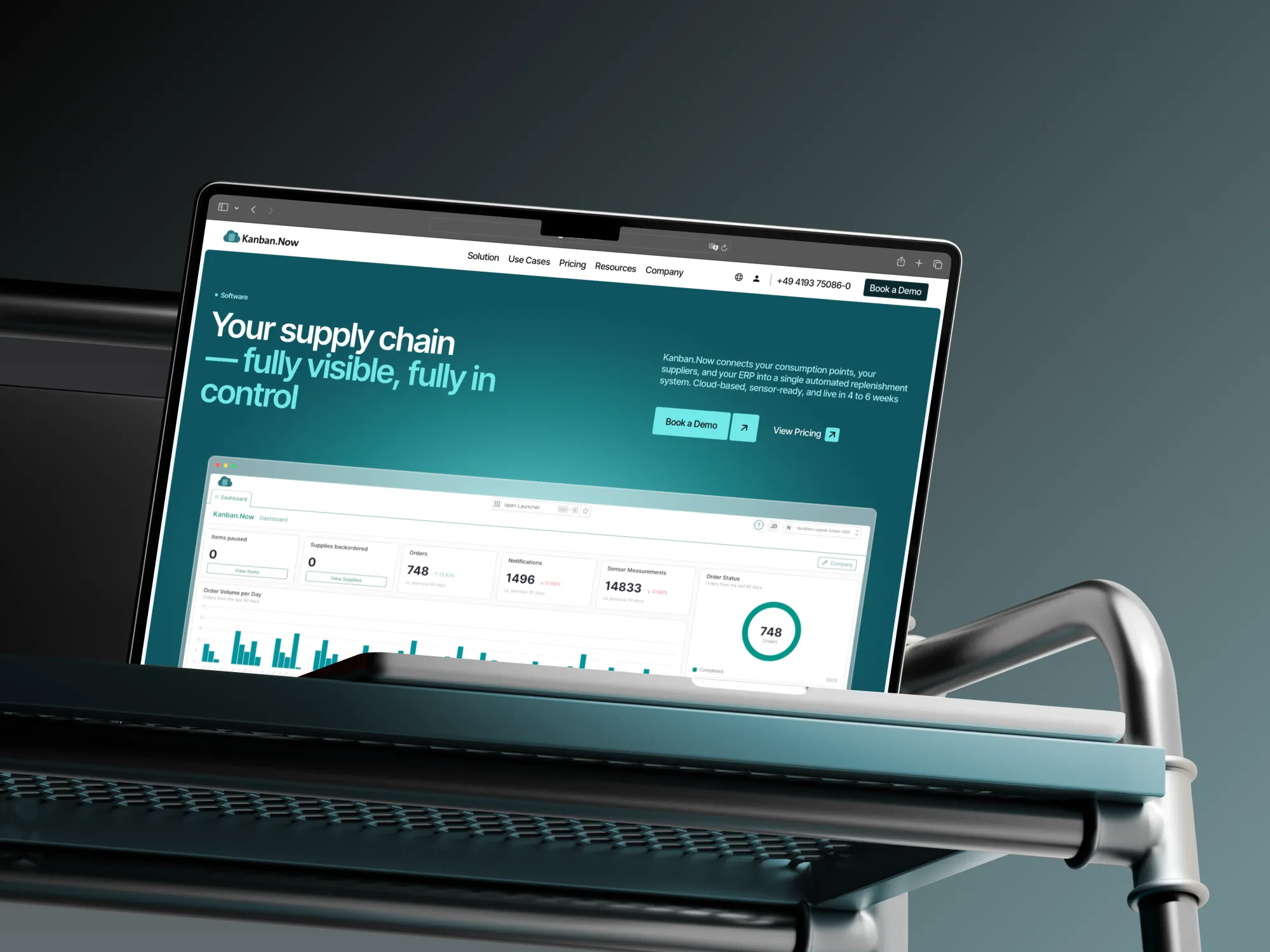
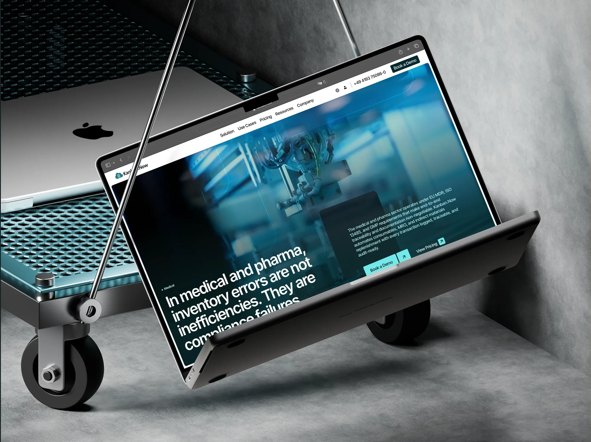
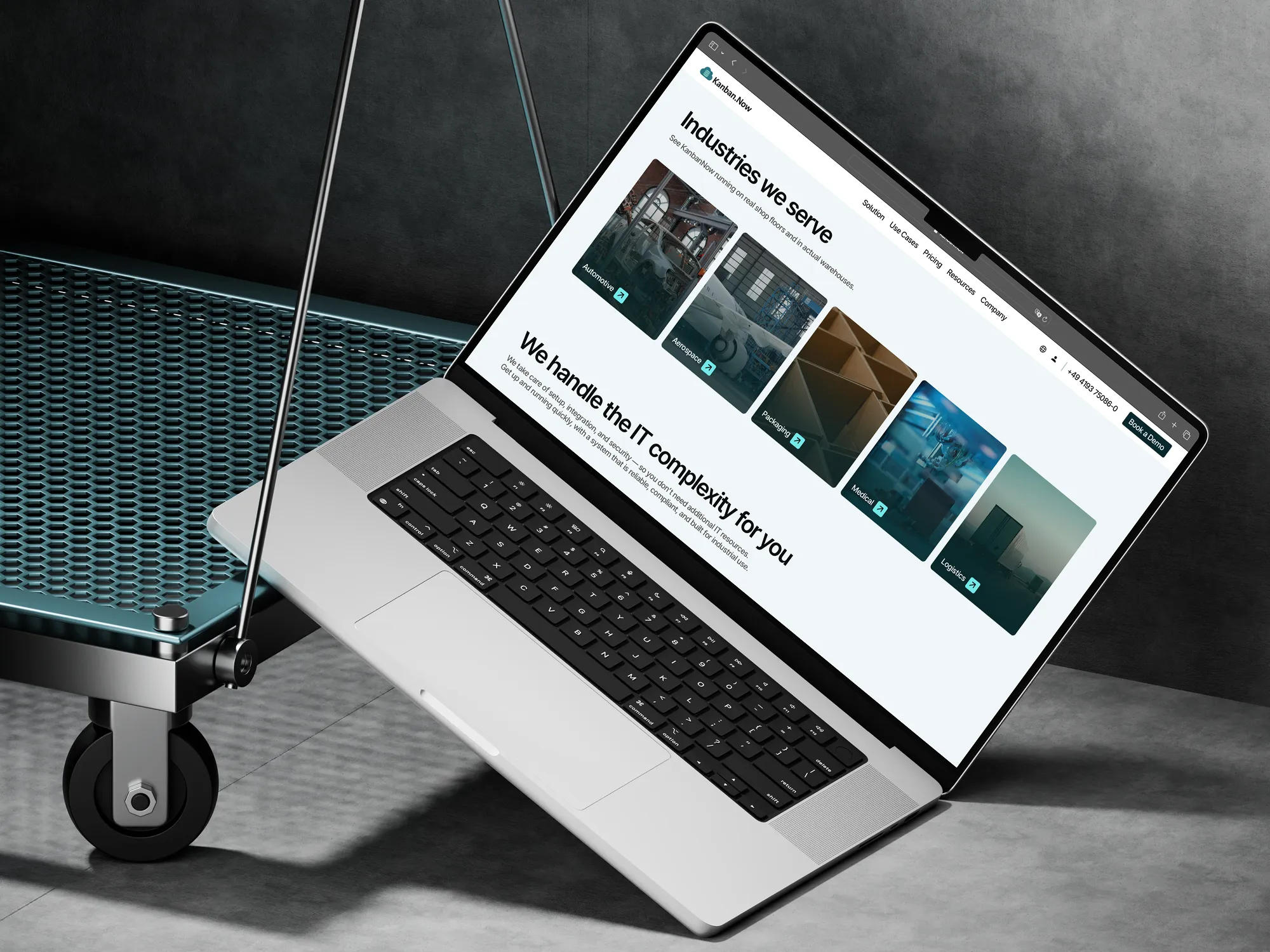
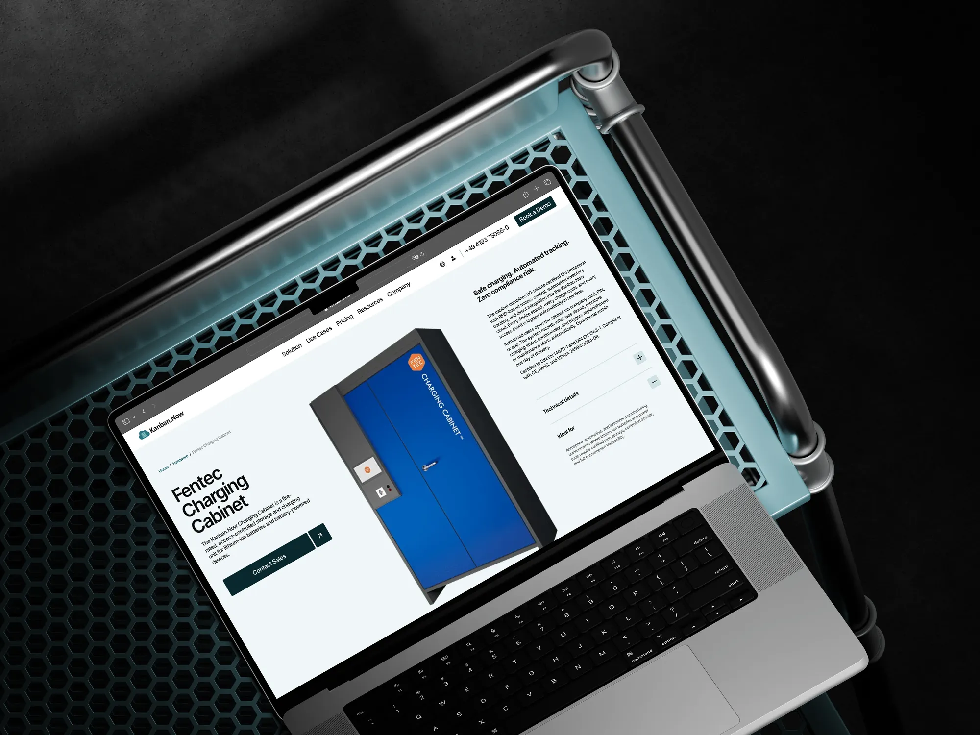
I redesigned and rebuilt the Kanban.Now website and refreshed the brand around it. The goal was to turn a complex industrial product into a clear, credible offer that decision makers in procurement, sales and internal logistics understand at first glance.

Kanban.Now is a cloud platform that automates material replenishment for manufacturers and logistics companies, from the demand signal to delivered stock. It is developed by HLS Business Systems GmbH, part of a German group that has optimised material supply for European manufacturers since the 1990s.
What Was Included:
- Site structure and message outline
- Website redesign
- Webflow development in English and German
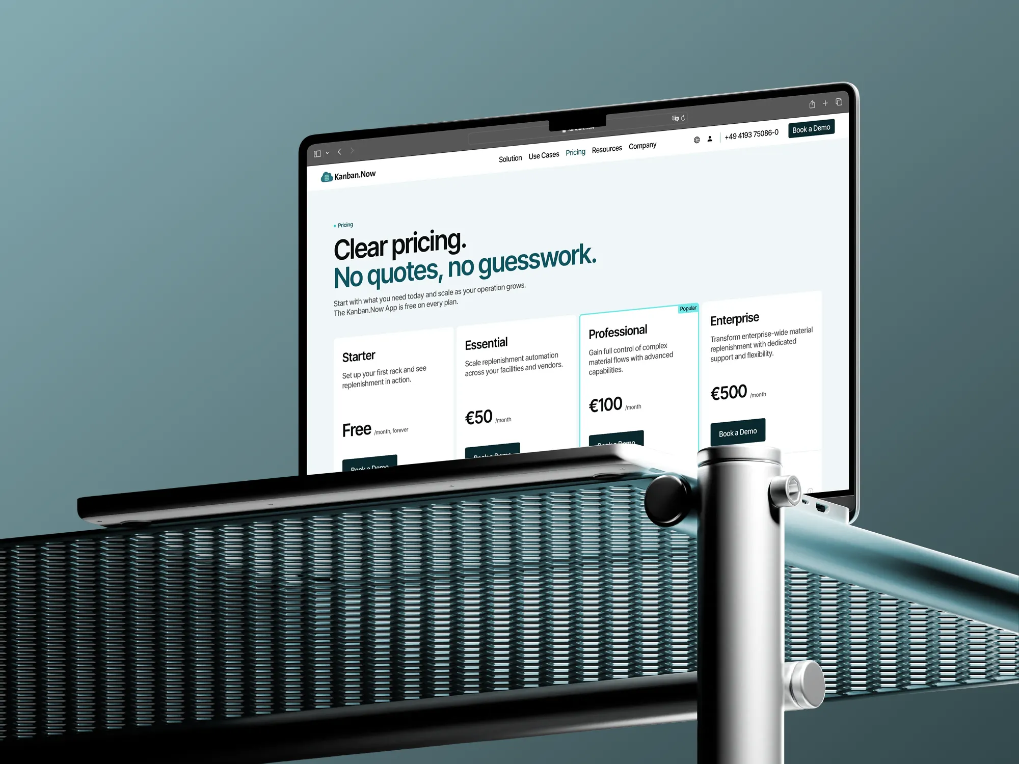
- Pricing page redesign
- Refreshed brand palette and typography
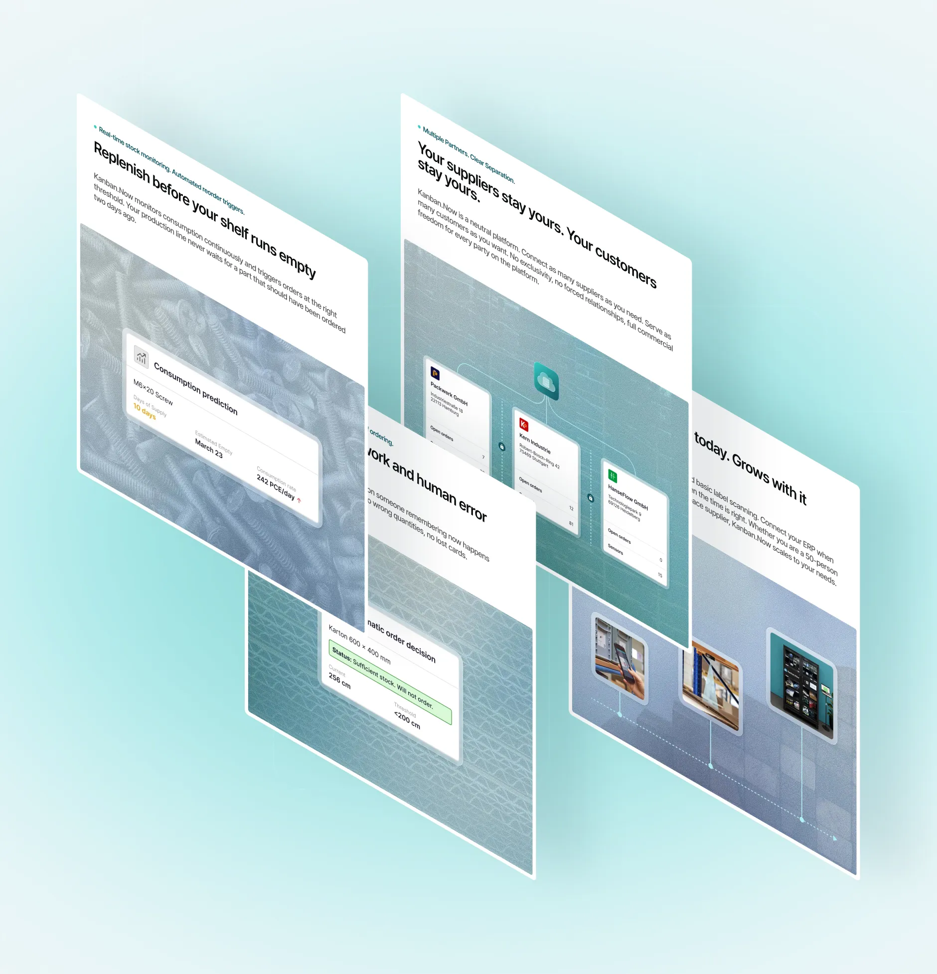
- New graphic elements and supporting imagery
- Design system for the internal team
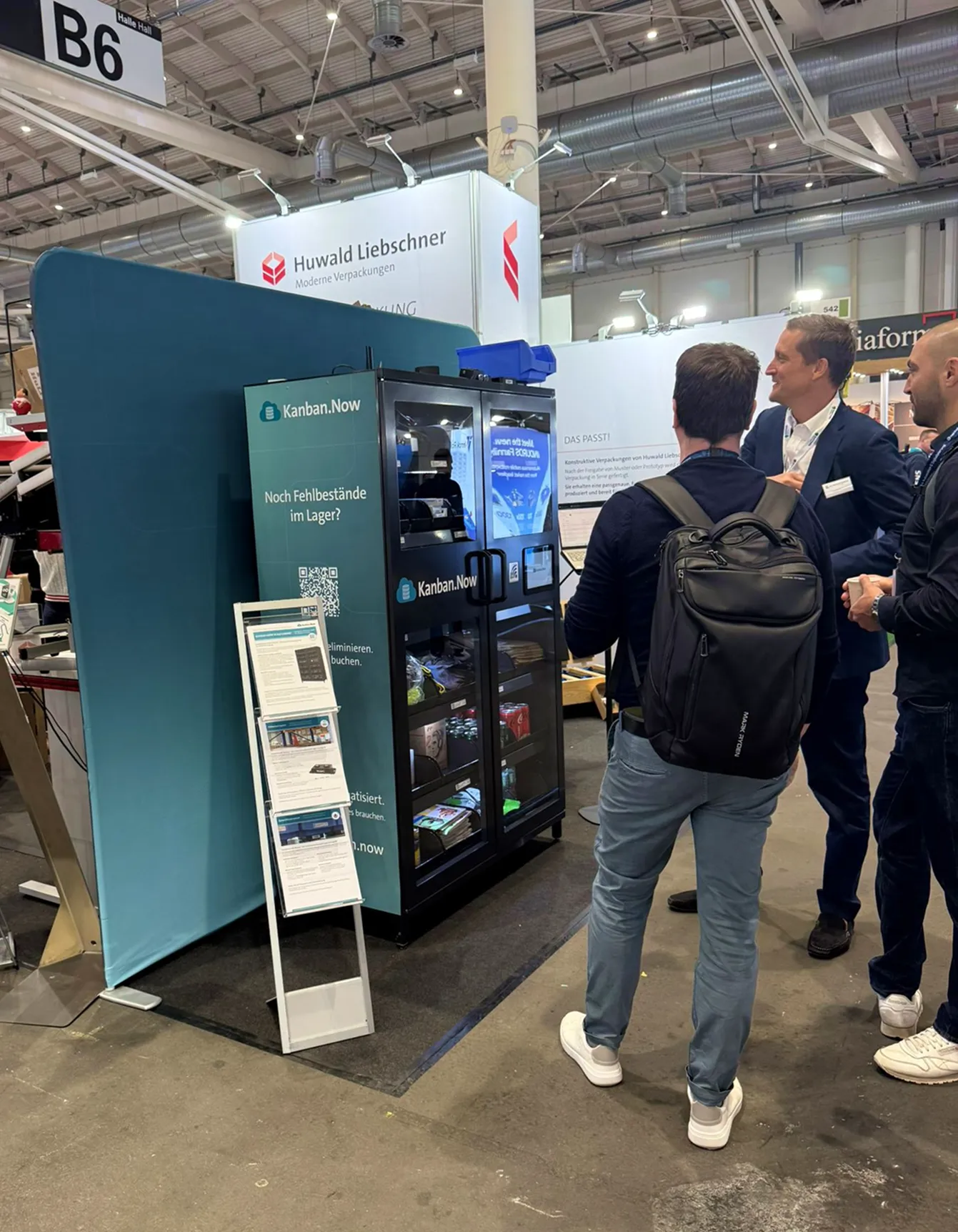
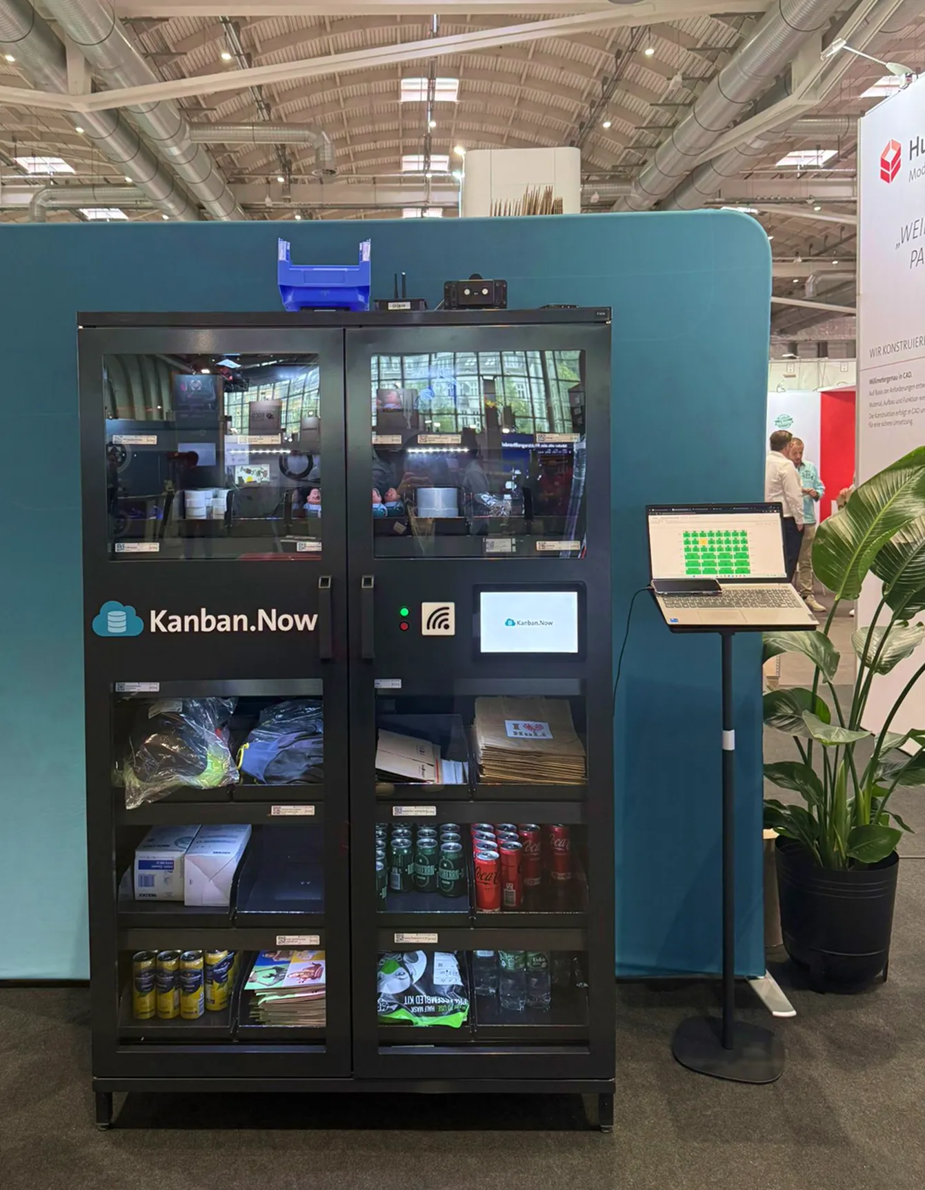
The team now uses the same system for their own materials, such as trade-show stands.
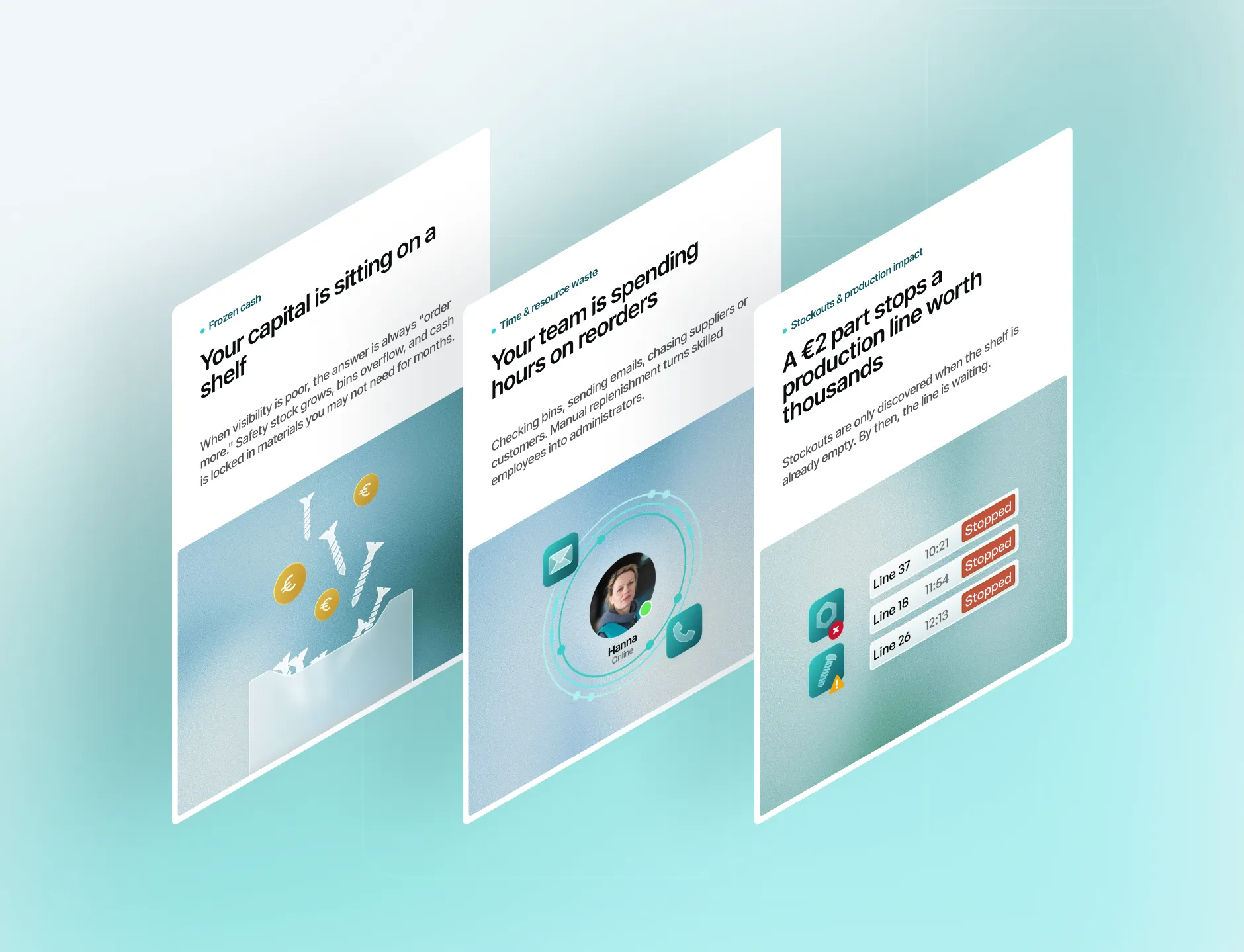
Kanban.Now solves a real and costly problem: stockouts, frozen capital and hours of manual reordering. The previous website did not show that. Visitors could not quickly understand what the product does, who it is for, or what it costs.
- The offer was buried under technical detail, so buyers had to work to understand the value.
- The pricing page was too complex to compare plans or pick one with confidence.
- Pages looked inconsistent and outdated, with no clear visual system.
- For buyers in procurement and production, the site did not feel trustworthy enough to book a demo.
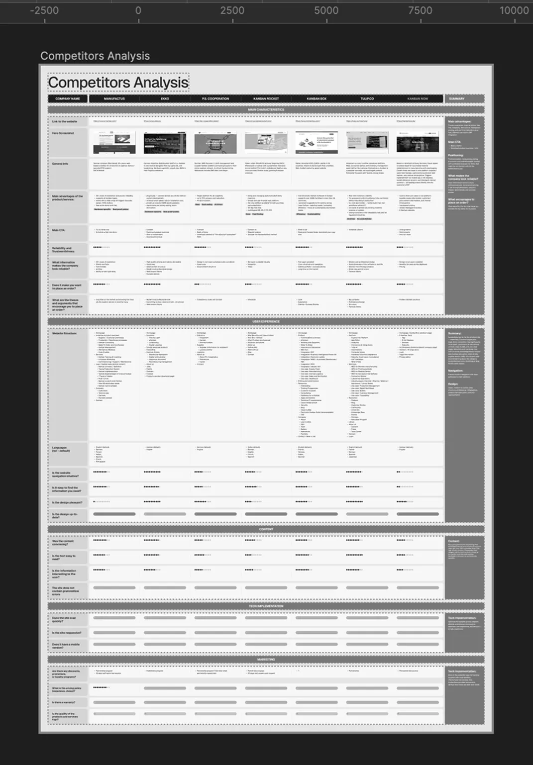
Before designing a single screen, I analysed the competitors in depth to see how they explain similar products, and where Kanban.Now could stand out.
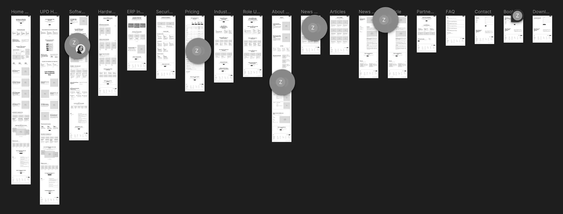
Based on that, I defined the site structure and the core message. I outlined what each page should say and in what order, and the team wrote the final copy from that outline. The goal was simple: a production manager should understand what Kanban.Now does within seconds.
- One clear promise. The homepage opens with a single sentence: your material supply, fully automated. Every section below follows the same logic: the cost of the problem, how the product solves it, and why to trust it.
- A path for every client. Navigation is split by industry and by role, so each visitor finds a page written for their situation.
Plan names that sell the right plan
The pricing already had the right structure: four plans. The problem was in the names. The plan the team wanted to sell most was called Premium. For a small or mid-sized manufacturer, that word signals "expensive", even though the plan costs a reasonable monthly fee for what it delivers.
I flagged the issue and set the direction: names that sound serious and describe who each plan is for. The team chose the new names based on it. Premium became Professional, still credible but without the imagined price barrier. In the design, the recommended plan is highlighted, so visitors know where to look first.
Free → Starter
Basic → Essential
Premium → Professional
Enterprise unchanged
A calm, precise brand for an industrial product
Alongside the website, I refreshed the brand identity. The logo and the core brand colours stayed as they were. I extended the colours into a fuller palette, updated the brand typeface, and created new graphic elements: gradients, "pipelines" and supporting imagery. The result feels modern and technical, yet calm and easy to trust.
The website is built in Webflow on the Finsweet Client-First framework, in English and German. Industry and role pages run on CMS templates, so the team can add new markets without a designer.
A design system proves itself when it works without the designer. The Kanban.Now team used the new brand system to design their own trade-show stands, and they stay consistent with the website.
Mobile
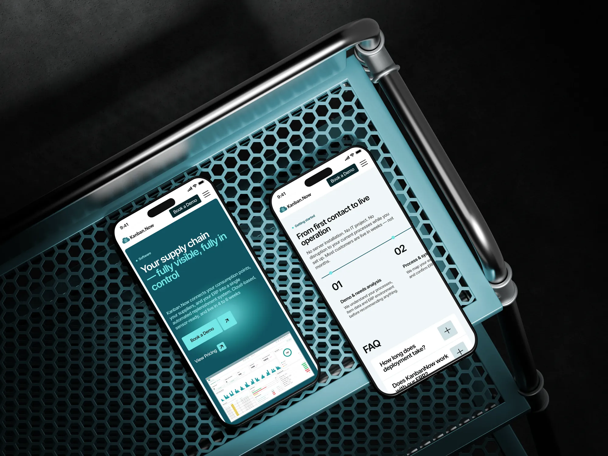
Many buyers first open the site on the shop floor or between meetings. The mobile version keeps the same clear order: promise, problem, solution, proof and one clear call to book a demo.
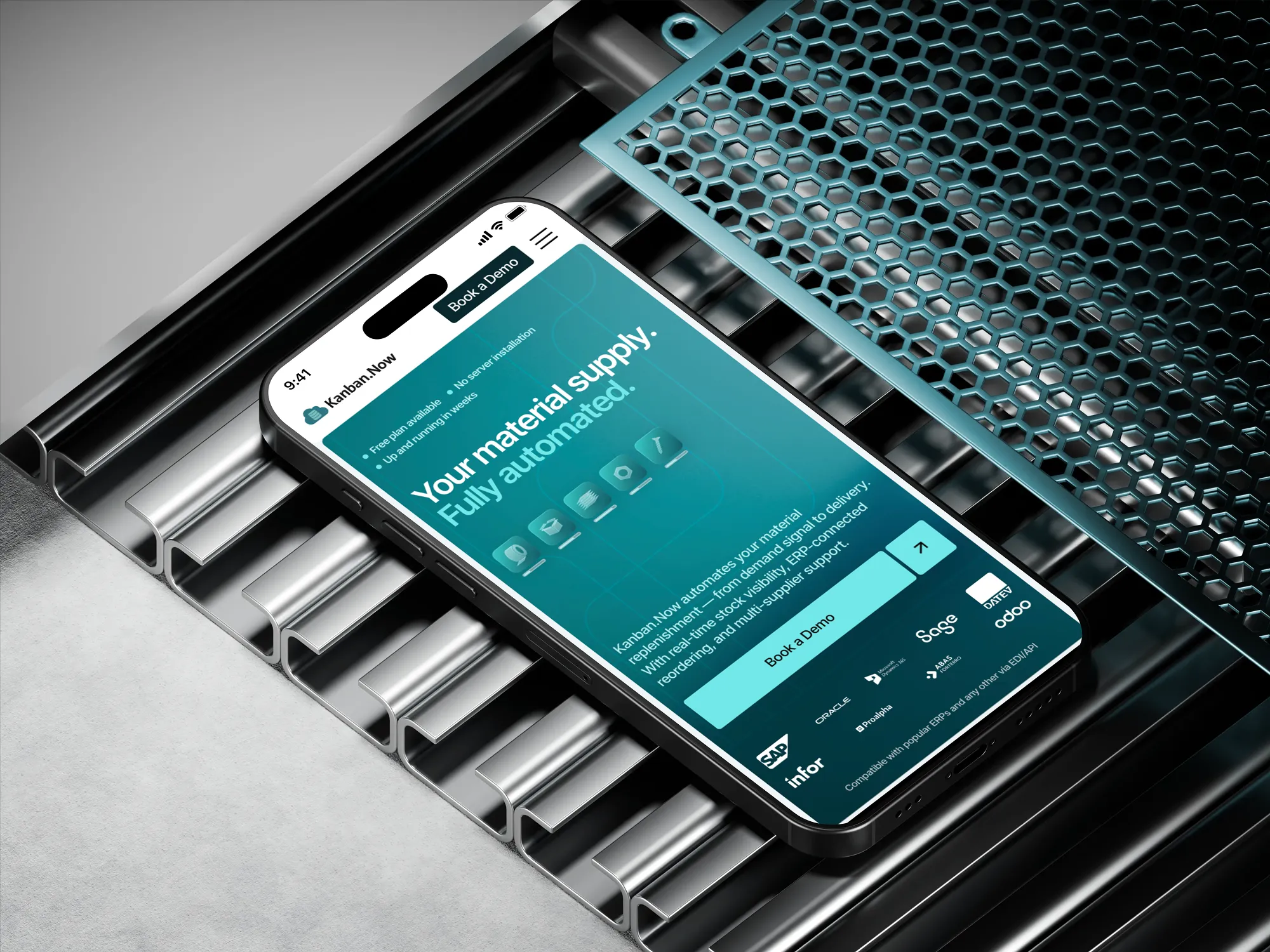
After the relaunch, Kanban.Now started receiving the kind of leads they were aiming for. The website now explains the product in seconds, pricing is easy to compare, and the brand looks as reliable as the technology behind it.
The design system lives on beyond the website. The team uses it on their own at trade shows, and the brand stays consistent across touchpoints.
Client's Feedback

The website is great! We're getting some bookings from people with relevant use cases. So far, so good! As we're preparing for the trade show, I'm hoping the website will become even more instrumental in securing new leads.